No ordinary place
Palmer bar nestles under the recognisable ‘scoops’ of Auckland’s iconic modernist building at 1 Albert Street—designed by Neville Price in 1972.
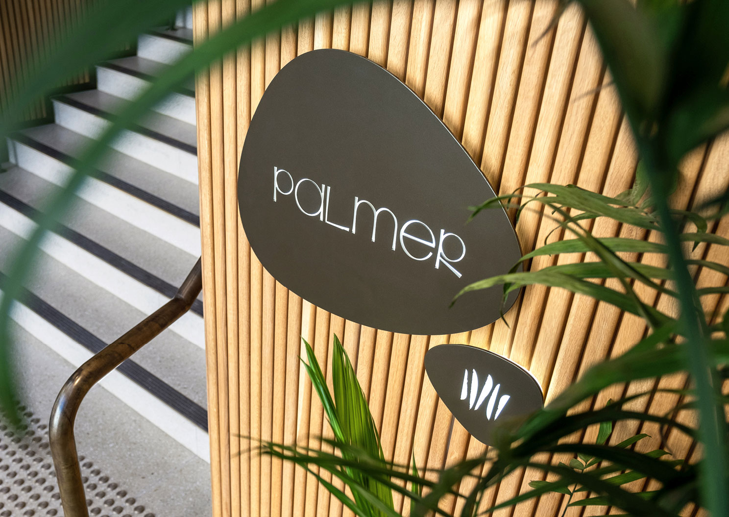
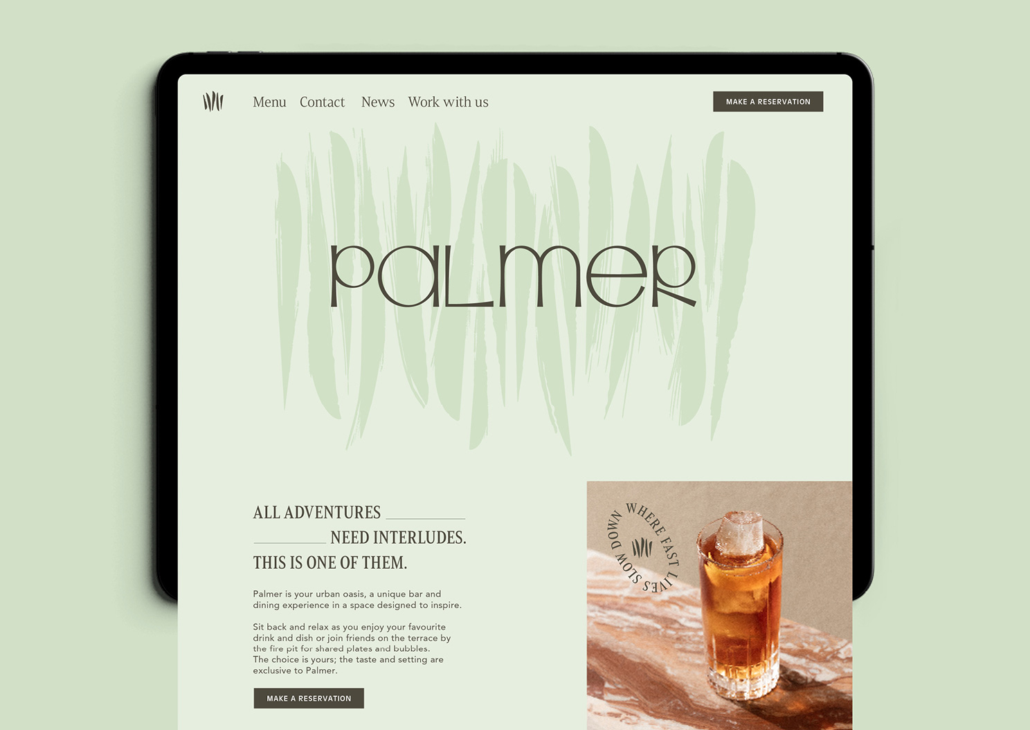
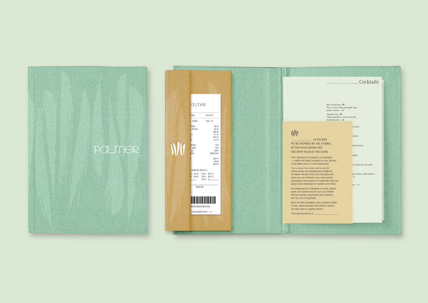
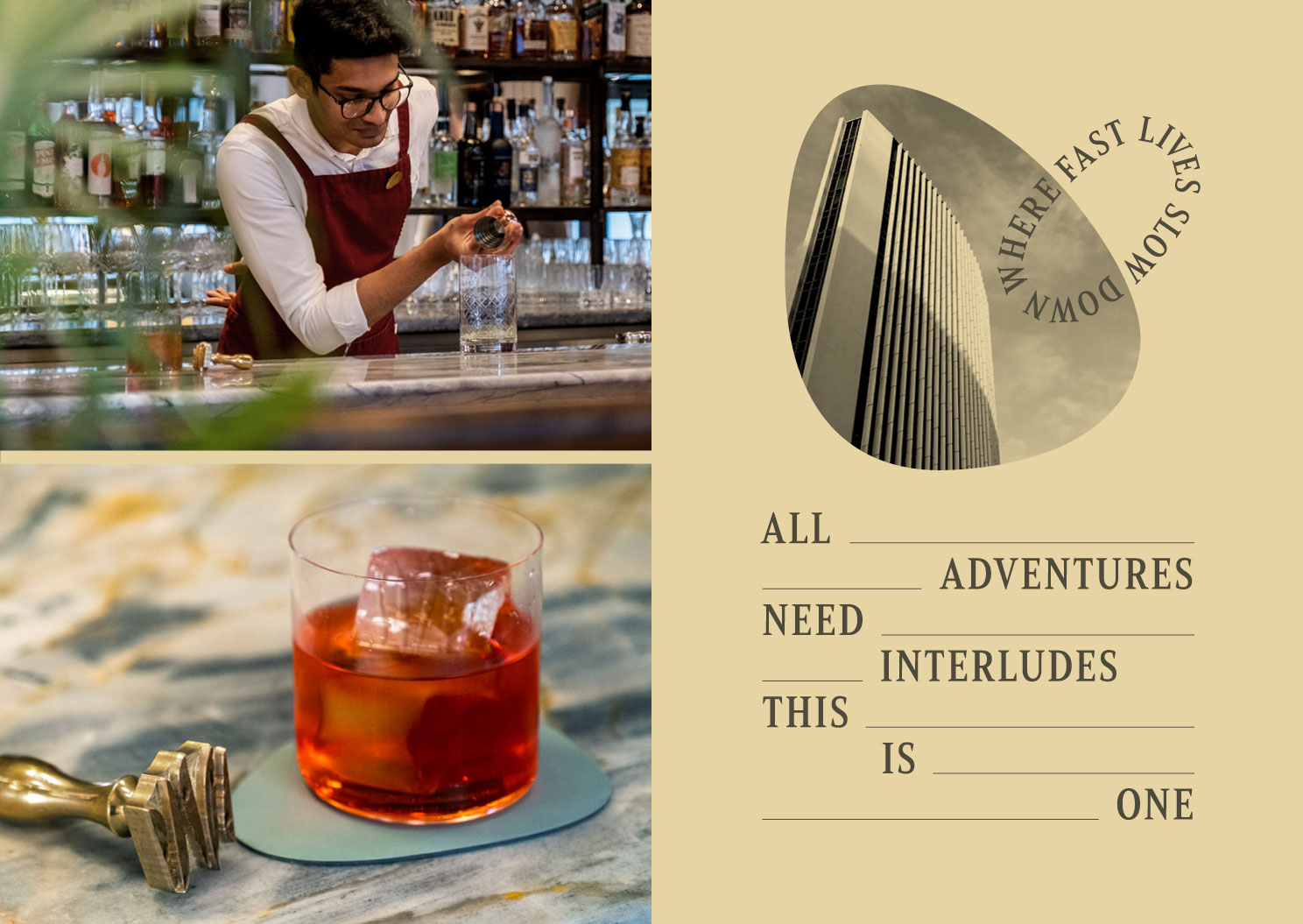
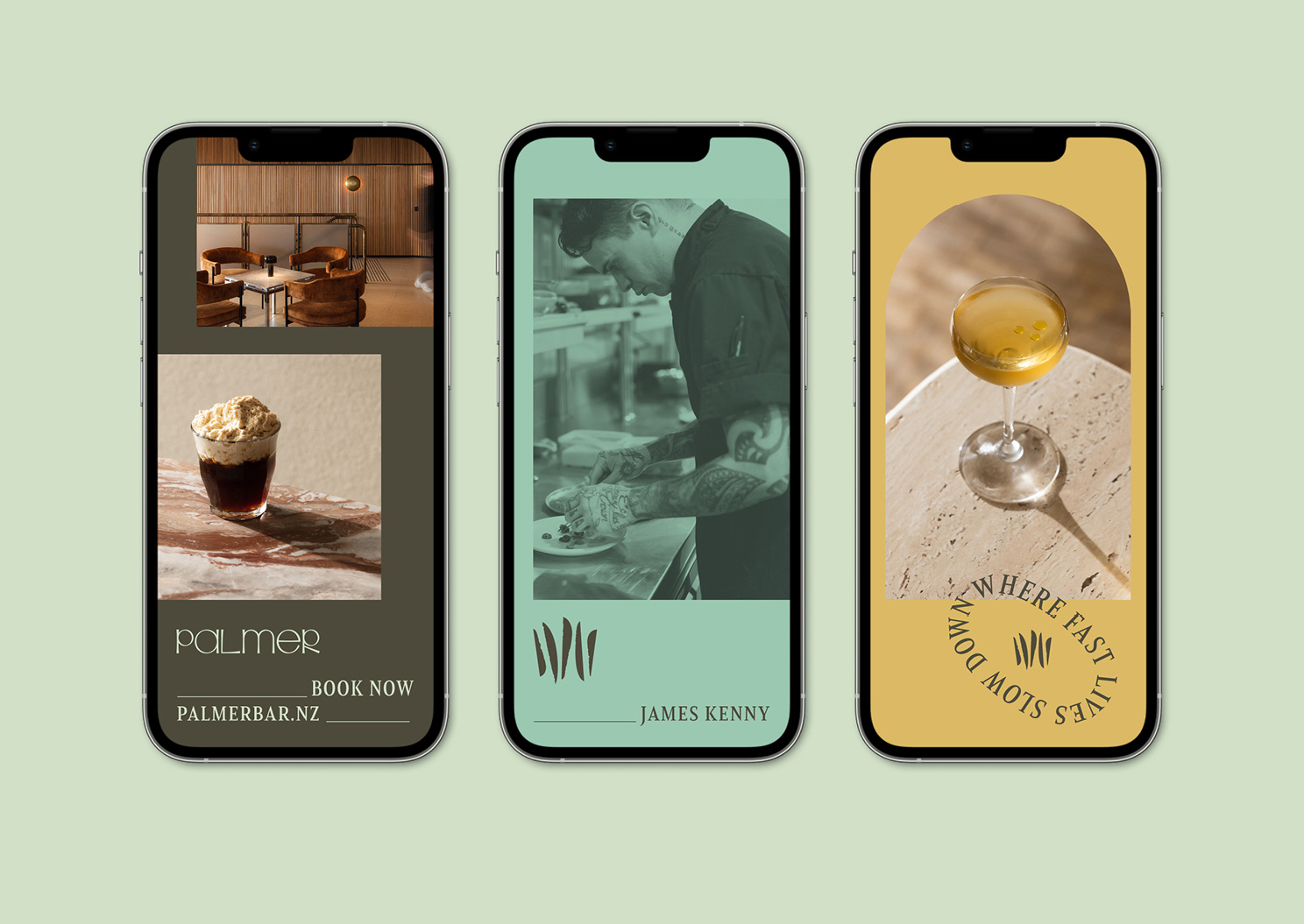
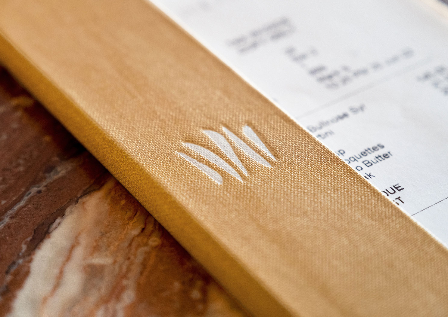
Asked to name and create a brand for this blank canvas, Palmer was inspired by the symbol of the palm frond and the open palm of the hand. They represent the essence of hospitality—a place and space to pause on your journey, to be taken care of, to be transported. An oasis to drink in the blissful shade, a gathering point for fellow travellers, to wander, to seek (palm branches were worn as a symbol of a pilgrimage).
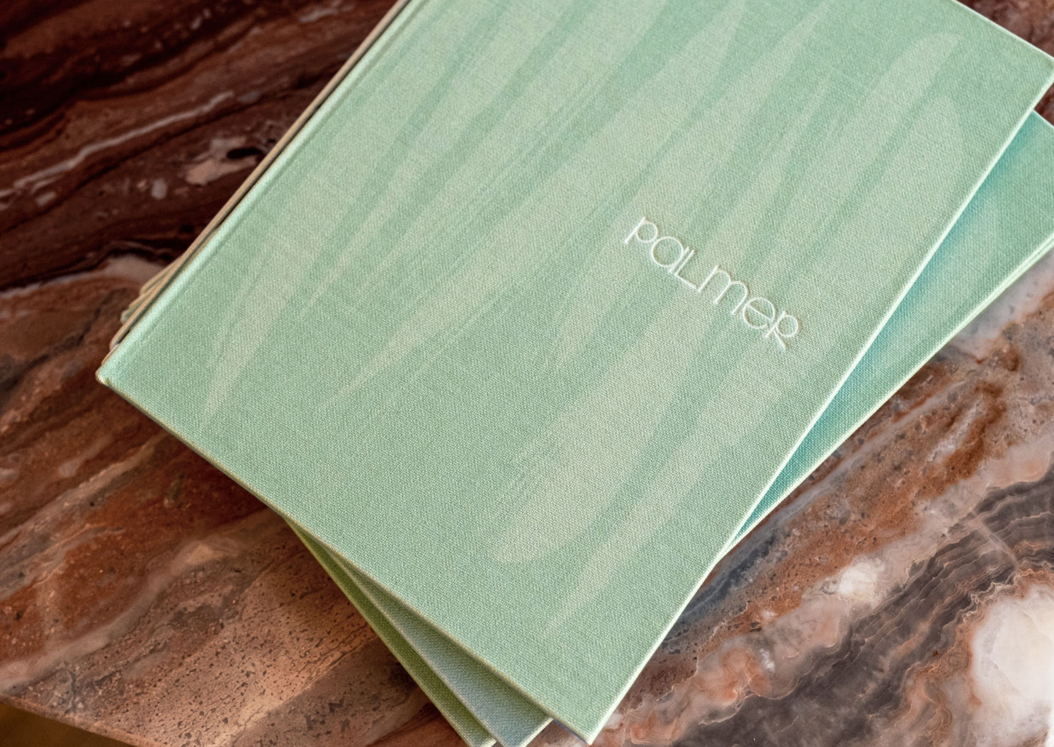
These influences all combine with a modernist-influenced typographic mark with quirk and personality, paired with a five-fingered welcoming ‘palm’ icon. A playful pattern brings to life the soothing shadows of palm fronds—all bound together in calming greens and sand (just a hint of the Palm Springs vibe).
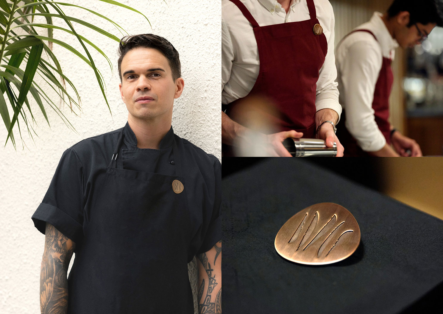
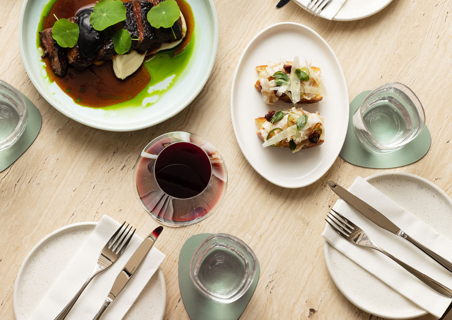
Organic shapes mimicking the wind scoops of the building are found in the signage, lapel pins and coasters; grounded in mid-century through the use of bronze metals. Photography is simple and plays with light and strong shadows. Language is luxurious and soothing with a spritz of playfulness.
Continuous consultation and co-creation with the architects, interior designer, art buyer and clients made sure everything was harmonious and the perfect place to spend an afternoon and evening.